
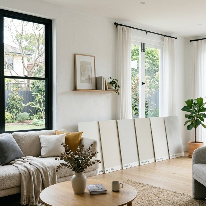
Choosing a paint colour should feel exciting. But if you’ve ever watched a “perfect” neutral turn murky in the afternoon, or had a crisp white suddenly look creamy under downlights, you already know one of the trickiest parts of interior painting: paint is a chameleon.
In Sydney homes, colour changes can feel even more dramatic. We get bright, high-contrast daylight, fast-moving cloud cover, and plenty of reflective surfaces (glass, pale flooring, glossy cabinetry) that bounce light around a room. Add in the reality that most of us judge colour quickly — in a shop, on a phone screen, or from a tiny sample — and it’s easy to make a choice you regret once the whole wall is done.
This guide gives you a practical, repeatable system to test paint colours properly at home, so undertones don’t surprise you and daylight timing doesn’t trick you.
Why does paint look different once it’s on your wall
There are three forces at play:
• Light source: Daylight shifts across the day; artificial lighting adds its own colour cast (warm or cool).
• Surroundings: Floors, rugs, cabinetry, benchtops, tiles, and even the garden outside your window reflect colour into the room.
• Scale: A small swatch can look neutral, but a full wall will reveal the undertone (green, pink, violet, yellow, blue).
Quick Q&A: Why does the same colour look different at night?
Because you’re no longer viewing it under daylight. At night, your globes take over — and warm LEDs can make whites look creamy, while cooler lighting can sharpen greys and pull them bluer or greener. If you want a simple explanation of how home lighting affects colour perception (including colour temperature and rendering), this resource is helpful: YourHome – Lighting.
The one-sentence method that prevents most paint regrets
Test colour big enough, in more than one location, at more than one time of day, beside neutral references, and only judge it once it’s fully dry after two coats.
It’s not complicated — but skipping any part of that sentence is where most people go wrong.
Step 1: Narrow your shortlist before you paint anything
More options don’t mean more clarity. It usually means more confusion.
For one room, aim for:
• 3–5 finalists maximum
• One “safe” baseline neutral you already trust
• One option slightly lighter than your instinct
• One option slightly deeper than your instinct
Why include lighter and deeper? Because the biggest mismatch between “sample” and “finished room” is often that the chosen colour ends up feeling darker, greyer, or heavier once it’s everywhere.
Quick Q&A: How many sample colours should I test at once?
Three to five is the sweet spot. More than that turns your wall into a collage, and your brain starts judging colours based on what they’re next to rather than how they actually behave in the room.
Step 2: Choose the right testing format (wall, board, or peel-and-stick)
Each method has a purpose. The goal is to use the format that answers your biggest question: “How will this colour behave in my space?”
Option A: Paint directly on the wall
Best for: seeing interaction with your true wall texture, the room’s light, and nearby surfaces.
Do it properly:
• Paint two coats
• Go large (we’ll cover sample size next)
• Label each patch with painter’s tape so you don’t mix them up
When this works best: older Sydney homes with textured walls, patching, or subtle plaster variation — wall texture can change how colour reads.
Option B: Paint on a movable sample board
Best for: testing the colour in multiple locations without marking up your walls.
How:
• Use a smooth board (primed MDF, a sample panel, or sturdy card designed for paint)
• Paint two coats
• Move it around the room: by the window, in the shadowed corner, near cabinetry, near artwork
Why it’s brilliant: open-plan living areas in Sydney often have different light “zones” (kitchen vs lounge vs hallway), and a board makes that obvious fast.
Option C: Peel-and-stick samples
Best for: quick shortlisting.
Be realistic:
• They don’t always match the exact finish you’ll use
• Lighting and wall colour still influence what you see
• Treat them as a shortlist tool, not the final decision-maker
Step 3: Sample size — the part most people underestimate
Tiny swatches are the enemy of confidence. They hide undertones and exaggerate the influence of the existing wall colour.
Use this minimum:
• 50 cm x 50 cm per colour
Even better:
• A tall rectangle around 30 cm x 90 cm
Why the tall rectangle works: it shows you how the colour changes from top to bottom as light falls differently across the wall.
Quick Q&A: How big should a paint sample be?
Big enough that you can judge it from where you actually live — standing in the doorway and sitting on the couch — not only with your face 10 cm from the wall.
Step 4: Put samples in the right places (not just “somewhere”)
If you only sample in one spot, you’re not testing the colour — you’re testing one lighting condition.
Test each colour in at least two locations:
• Near the window (stronger daylight and reflections)
• On a darker wall or corner (where the colour deepens)
If possible, add a third:
• Near a dominant surface (timber floors, grey tiles, white cabinetry, coloured rug, or a big piece of furniture)
This is where the “why does it look different on that wall?” problem gets solved before it becomes a repaint.
Step 5: Undertones — how to spot them without guessing
Undertones are the subtle colour bias underneath a paint colour. They’re the reason a neutral can suddenly look green, purple, or pink once it’s on a big surface.
Common undertones:
• Warm: yellow, red, orange
• Cool: blue, violet
• Sneaky neutrals: green (common in many greys), pink (some beiges), purple (some cool greys)
The simplest undertone test (that actually works)
You don’t need fancy tools. You need a comparison.
- Compared to true white
Hold a clean sheet of white printer paper next to the sample.
• If the sample looks creamier, it’s warmer.
• If it looks icy, it’s cooler.
• If it looks slightly swampy, you may be seeing green. - Compared to a neutral grey
If you have a known “true grey” sample (or even a grey notebook cover you trust), it can reveal whether your colour is pulling green or violet. - Check the edges
Undertones often show at the boundary where the sample meets the existing wall colour. - Isolate when needed
If your current wall colour is strong, use a sample board or paint a primed rectangle first so you’re not judging a colour through the lens of what’s already there.
Quick Q&A: How do I know the undertone of a paint colour?
Never judge it alone. Compare it to white paper and a neutral reference, then look at it in both bright daylight and your night lighting. Undertones are easiest to see when the colour sits beside something truly neutral.
Step 6: Daylight timing — the Sydney-friendly schedule
Testing once at midday is how people end up confused later.
Use a simple timing plan:
• Morning (often cooler, softer)
• Midday (bright, can flatten colour)
• Late afternoon (warmer, can intensify undertones)
• Night (your actual bulbs)
If you’re short on time, do:
• Late afternoon + night
Why this matters in Sydney:
• Afternoon sun can make warm neutrals look richer (and sometimes too yellow)
• Overcast conditions can make greys feel heavier and colder
• Reflected outdoor colour (greenery, brick, fencing) can tint light coming in
Quick Q&A: What time of day should I check paint samples?
At least twice in daylight and once at night. Late afternoon and night are the “truth tests” where undertones usually reveal themselves.
Step 7: Dry-down — why one coat is never enough
Paint changes as it dries. Some colours deepen. Others lighten. Many neutrals reveal undertones only once they’re fully dry.
Rules that save you:
• Don’t decide on wet paint
• Always judge after two coats
• Ideally, check the next day again
Also, blotchy sample patches can make a colour look dirtier or duller than it will be once properly applied. If your sample looks streaky, that’s a sampling problem, not necessarily the colour.
Step 8: Sheen changes colour more than people expect
Even if the colour name and code are the same, sheen affects how light reflects.
Typical behaviour:
• Matte: softer look, hides wall flaws, can feel slightly deeper
• Low-sheen/eggshell: balanced, practical, often appears a touch brighter
• Semi-gloss: reflective, can highlight texture, can look “cleaner” but also more revealing
Testing tip:
• Try to sample in the same sheen you plan to use — especially for whites and pale neutrals.
Quick Q&A: Why does the same colour look different in matte vs low-sheen?
More reflective finishes bounce more light back to your eye, which can make a colour seem brighter and sometimes cooler. Matte absorbs light and can make colours feel richer or slightly darker.
Step 9: The 9 most common paint-testing mistakes
If you want a quick self-check, look for these:
• Testing only at night (or only at midday)
• Using tiny patches that don’t reveal undertones
• Sampling in only one spot
• Putting all colours side-by-side in a tight row (they influence each other)
• Ignoring what’s outside the window (trees, brick, neighbouring buildings)
• Forgetting floor and cabinetry reflection
• Expecting a phone screen to match real paint
• Not using a neutral reference (white paper)
• Deciding after one coat or before dry-down
A decision framework that stops the spiral
When you’re down to two favourites, ask:
- Which one stays most consistent across the day?
- Which one looks better in the darkest part of the room?
- Which one suits the finishes you can’t easily change?
• floors, benchtops, tiles, built-ins - Which one still looks good under your night lighting?
If one colour only looks good during one “magic hour,” it’s risky.
Special notes for Sydney homes: whites and greys behave differently
Whites: the undertone trap
Whites are where undertones are most unforgiving.
Do this:
• Test two whites: one warmer, one cleaner (neutral/cool)
• Compare to white paper
• Check at night — warm downlights can turn a warm white creamy fast
Greys and greige: the “green flip”
If you’ve had a grey go green, you’re not imagining it.
Do this:
• Compare to a neutral grey reference
• Test near timber floors and near outdoor greenery
• Re-check on an overcast day if possible (that’s when greys can feel heavier)
Quick Q&A: Why do greys sometimes look green?
Many popular greys have a subtle green undertone. Timber, warm lighting, and reflected outdoor greenery can amplify it — so the undertone that was “invisible” on a card suddenly becomes obvious on a wall.
What if you did everything right and you still can’t decide?
That usually means one of these is true:
• Your lighting is mixed (different bulbs in different fittings)
• Your fixed finishes pull the colour in opposite directions
• The room has strong colour reflection (big rug, bold couch, intense timber, garden reflection)
• You’re hovering around an “almost-neutral” that flips warm/cool depending on conditions
When that happens, your best move is often to:
• Step slightly warmer or slightly cooler (choose a clearer undertone)
• Or test one more option that’s closer to the dominant fixed finish in the room
Once you’ve chosen a colour you’re confident in, the part that tends to make that choice look “right” long-term is surface prep and consistency — especially with interior painting in Sydney, where bright daylight can highlight every small variation.
The 15-minute routine you can repeat for every colour
If you want a quick, no-drama system:
• Paint two coats on a large sample (min 50 x 50 cm)
• Place it in two or three light zones
• Check in the morning, midday, late afternoon, and at night
• Compare it to white paper
• View it from the doorway and from where you sit
• Decide only when it’s fully dry
If your samples keep “changing their mind,” it’s usually not you — it’s lighting, reflections, and surface variation, which is exactly what professional interior painting is designed to control before the first coat goes on.
FAQs
Should I test paint on the wall or on a board?
If you can, do both: a board lets you move the colour around the room, while a wall patch shows how it behaves on your actual wall texture. If you only do one, choose a board when you need flexibility, and a wall patch when texture is a big factor.
How long should I wait before judging a sample?
After the second coat is fully dry, then check it again the next day. Neutrals often reveal undertones more clearly with time and consistent lighting.
Do I need to prime before testing samples?
If your wall is very dark, stained, or patchy, priming a small test area can give you a truer read. If you don’t want to prime, use sample boards so the existing wall colour doesn’t interfere.
Why does the colour look different on different walls in the same room?
Because each wall gets different light (direct, reflected, shaded) and reflects different surrounding surfaces. The same paint can look warmer near timber, cooler near grey tiles, and greener near outdoor foliage.
What lighting should I use when testing at night?
Use the exact lights you’ll live with — downlights and lamps — because those bulbs become your “new daylight” after sunset. If you’re thinking of changing globes, change them first, then test.
What should I think about after I’ve chosen the colour?
Sheen and durability are often the next make-or-break decision, especially for hallways, kids’ rooms, and rental wear-and-tear — and that’s where interior painting services in Sydney connect to how the colour will actually hold up day to day.