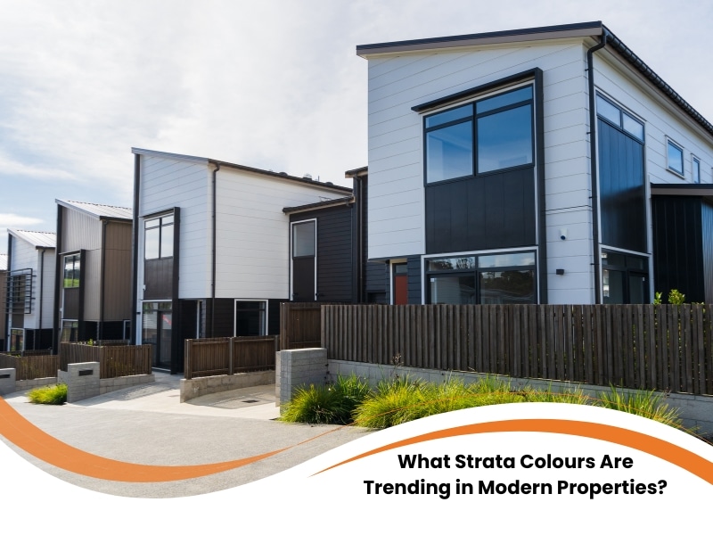
Modern strata properties are favouring soft neutrals, earthy tones, deep accents, and heritage-inspired palettes that combine style with durability. Picking strata colours is never as easy as it sounds. Whether you’re managing a coastal complex in Bondi or a federation-style block in the Inner West, the wrong paint job can make a place look worn out before its time. Today, it’s not just about making the place look sharp for resale — colour choices affect resident pride, council approvals, and the long-term upkeep of the building. This guide unpacks where managers go wrong, what palettes are getting noticed, and how to make brighter colour calls that’ll still hold up in five or ten years.
Why is choosing strata colours such a challenge for property managers?
Strata colour selection is complex because it must balance aesthetic appeal, regulatory compliance, resident preferences, and environmental durability. Let’s be honest — getting people to agree on anything in a strata committee is tough enough. Now throw paint colours into the mix, and it’s a whole new level of tricky.
- You have council regulations, heritage overlays, and neighbour considerations to consider.
- Residents have different tastes — what’s elegant to one can feel bland to another.
- Specific colours fade faster or show grime more quickly depending on exposure.
- Cheap products or poor planning can mean another paint job in just a couple of years.
With so many moving parts, it makes sense to lean on proven picks like the best strata paint colours in Sydney that are designed for our climate and building types.
What mistakes do strata managers make with paint colour selection?
Common mistakes include ignoring lighting conditions, skipping test patches, using high-maintenance finishes, and selecting colours that clash with surroundings. One of the biggest traps? Picking colours off a tiny swatch under fluoro lights in an office. What looks warm and clean there might turn icy blue or dingy grey in daylight.
- Some go bold to be modern but don’t test it on the actual surface — scale changes everything.
- Others forget about the roof or trims, so nothing matches.
- There’s often no thought for longevity — gloss on balustrades looks great day one, scuffed and patchy by year two.
- Too many rely on gut feel instead of testing under real conditions.
This is where neutral colour choices for strata exteriors really shine — they’re reliable, easy to maintain, and sit well in any setting.
How can the wrong exterior colour scheme affect property value?
Poor colour choices can reduce curb appeal, suggest neglect, and ultimately lower property value by turning away potential buyers or tenants. When a building’s colours are off, people notice — and not in a good way.
- First impressions count: faded paint or clashing colours scream “neglected”.
- Buyers assume more problems lie beneath the surface.
- Heat-absorbing tones can spike power bills or wear out surfaces faster.
- If it looks cheap from the street, offers will follow suit.
Sometimes all it takes is one bad shade to sink a great building. Using the right products and finishes is key to protecting strata buildings with exterior paint that actually lasts.
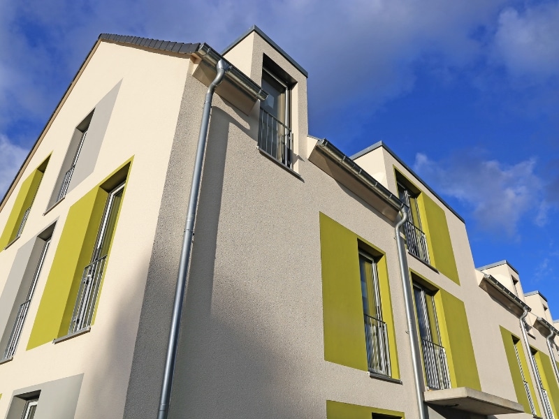
How are strata colour trends shaping modern property design?
Popular trends include muted neutrals, coastal palettes, earthy shades, and heritage tones that reflect location and architectural context. Strata colour trends have evolved. These days, they’re doing more than just following fashion — they’re helping buildings blend better with their surrounds or stand out where it counts.
- Muted neutrals like taupe, soft greys, and off-white tones bring a clean, understated look that works anywhere.
- Coastal schemes — think sandy tones and ocean-inspired greens — are all the rage along Sydney’s eastern suburbs.
- Earthy shades like clay and olive are being picked up in newer eco-conscious developments.
- Deep contrasts — navy trims or charcoal fencing — add sharp definition without overwhelming the design.
- Heritage blends are still popular in older pockets, offering that well-aged look with new paint tech.
Here are common strata colour palettes and their design benefits:
| Colour Palette | Typical Shades | Best For | Design Impact |
| Muted Neutrals | Taupe, soft grey, off-white | All building types | Creates cohesion and blends with surroundings |
| Coastal Tones | Sand, seafoam green, pale blue | Beachside strata and light-filled areas | Feels fresh, light, and open |
| Earthy Tones | Terracotta, olive, clay | Urban blocks, natural settings | Grounds the design with natural warmth |
| Deep Accents | Charcoal, navy, dark green | Trim, fencing, doors | Adds depth and modern contrast |
| Heritage Colours | Cream, heritage green, oxblood | Conservation zones, classic facades | Retains charm and aligns with council rules |
Before diving into any update, it’s smart to check the NSW strata renovation guidelines so you don’t accidentally break a rule.
How do colour choices influence resident satisfaction in strata living?
Strata colours affect resident satisfaction by shaping the visual atmosphere, promoting pride in shared spaces, and enhancing perceived cleanliness and safety. People might not talk about it much, but building colour affects how they feel about their home.
- Soft, light colours feel clean and welcoming — perfect for shared entrances and hallways.
- Uniform colours show care and consistency, which makes people more likely to look after the place.
- Too much contrast or heavy tones can be jarring and divisive.
- The strategic use of colour also boosts safety, as it highlights steps, rails, and ramps.
A building that looks calm, fresh, and well-maintained will always feel more like home — and it often brings out the best in the people living there.
Why should strata painting projects consider heritage colours?
Heritage colours are often required in conservation areas and provide timeless visual harmony that respects the building’s historical character. Old buildings deserve respect — and the wrong paint job can ruin their charm.
- Councils often insist on colour consistency with the original look, especially in historic zones.
- Heritage palettes are made to work with brick, sandstone, timber, and wrought iron.
- Straying too far from tradition can make your property stick out in the worst way.
- Residents and buyers alike value authenticity — and that’s what heritage colours deliver.
Even modern paints can mimic the soft finishes of the past. Done right, it’s a smart way to honour the building’s history while boosting its street appeal.
How does professional planning ensure durable building finishes?
Professional planning ensures durable finishes by using the proper preparation methods, paint systems, and application techniques for each surface and climate. A good paint job starts well before the roller hits the wall.
- Proper prep — cleaning, sealing, and repairing — is the foundation for long-lasting results.
- You must match the right paint system to the building material, sun exposure, and location.
- Glossy paints on rough walls? Bad combo. Same with low-quality paint in high-wear spots.
- Knowing how colours age over time in different weather helps avoid nasty surprises.
Skimping on this stage means the finish might look great for six months — then it will peel, crack, or fade quickly. Planning saves money and face.
Choosing strata colours for long-term appeal
Choosing strata colours isn’t a cosmetic job—it’s about function, compliance, and shared comfort.
Colour choices should never be rushed. They set the tone for how a property looks, feels, and holds value over time. Thoughtful planning, timeless tones, and suitable finishes are what separate a tired-looking block from one that stands the test of time. With guidance from Sydney Paintmasters, you’ll be well-positioned to avoid mistakes and create a result that everyone’s happy with.