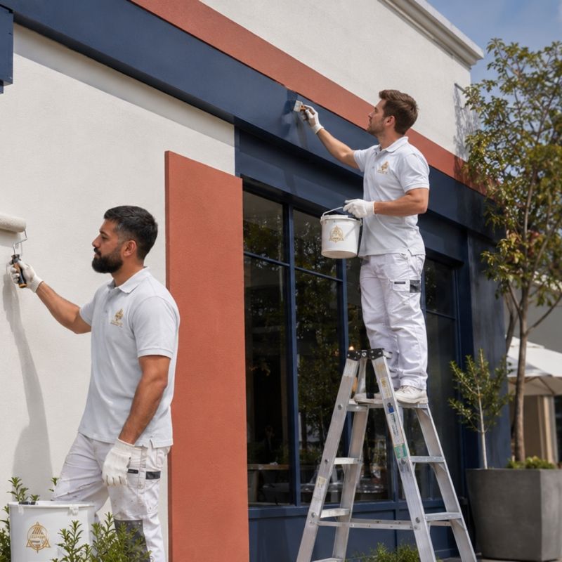
★★★★★
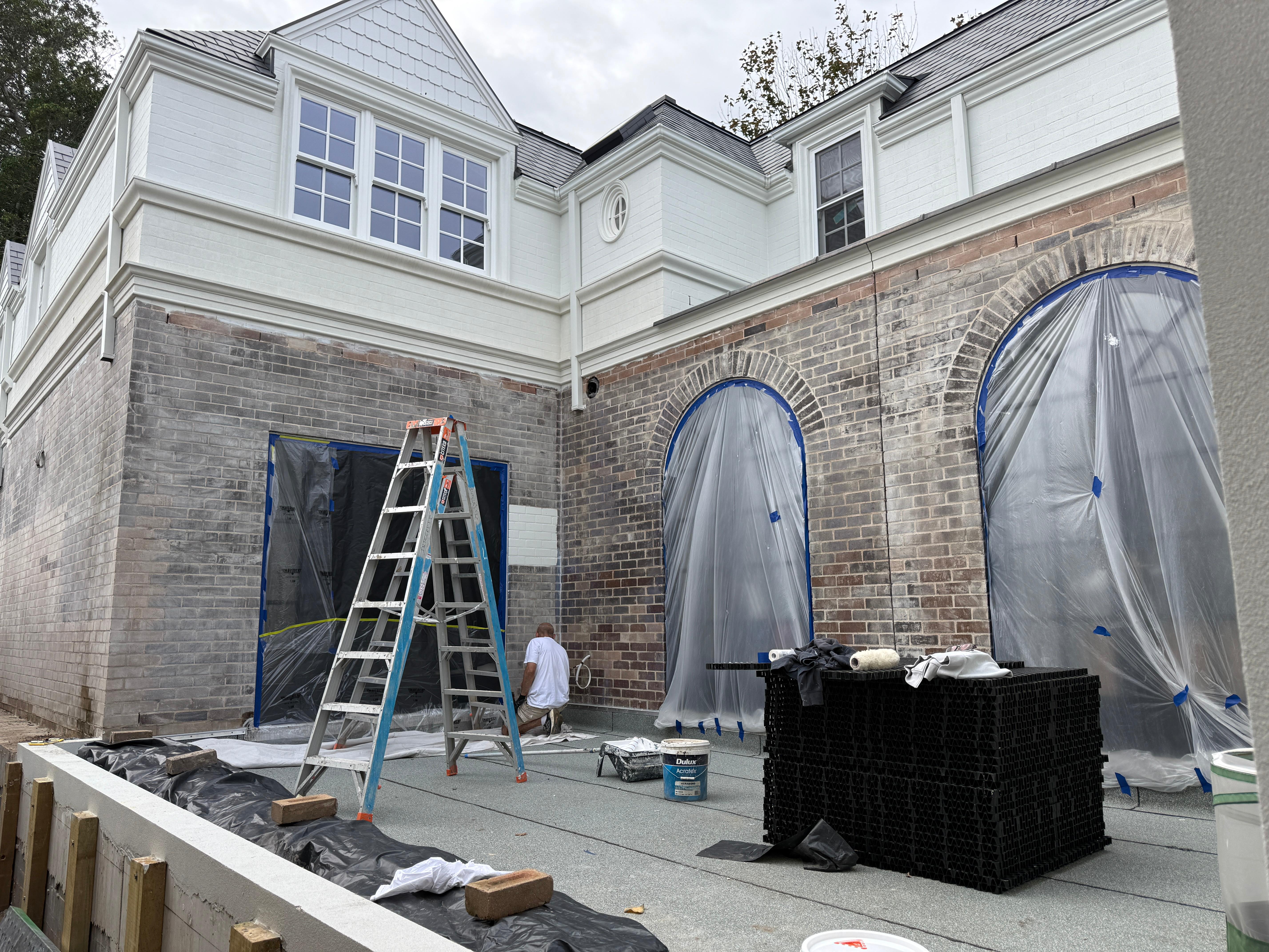
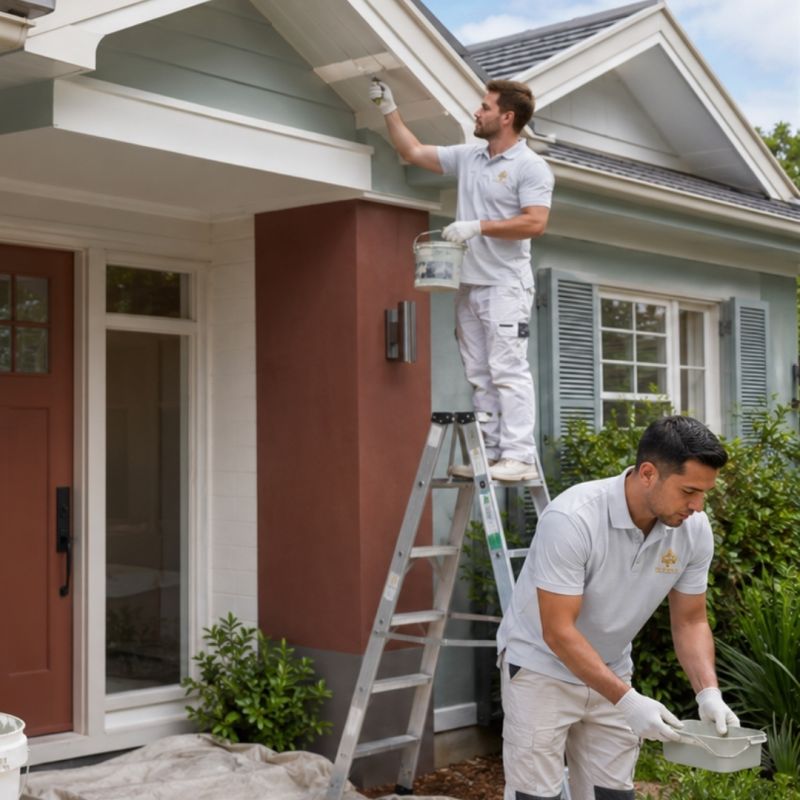
Excellent Workmanship and Professionalism! Bobby from Sydney Paint Master did an absolutely fantastic job painting the gutters, fascia, and eaves of my home. He spent two full days on the project, and his attention to detail was top-notch—from the thorough sanding to the careful application of the primer and weather-resistant coats. What really sets Bobby apart is his pride in his work. He voluntarily painted a vertical drainage pipe that wasn't even in the original quote just because he knew it would look better overall, and he repaired a timber cover strip on the eaves completely free of charge. He was incredibly tidy, cleaning up all the sanding debris before he left. He even took the initiative to coordinate with my neighbors to get their exact paint names so that both sides of our semi-detached house now match perfectly. Highly professional, trustworthy, and a beautiful finish. I highly recommend Bobby and Sydney Paint Master!
MZMichelle ZhuGoogle Review
★★★★★
Got four quotes and chose Bobby based on depth of knowledge - and absolutely paid off. He exceeded expectations and over delivered at every stage. Outstanding workmanship and real commitment to excellence. Highly recommend. I will be a repeat customer.
★★★★★
Absolutely fantastic experience. The price was very reasonable for the quality of work delivered, and the attention to detail was exceptional throughout. The job was completed incredibly quickly without compromising on finish. Everything looks flawless. I'd definitely use them again and wouldn't hesitate to recommend to others.
Response from the ownerHi Andy Thank you for your beautiful words we are glad you are so happy
★★★★★
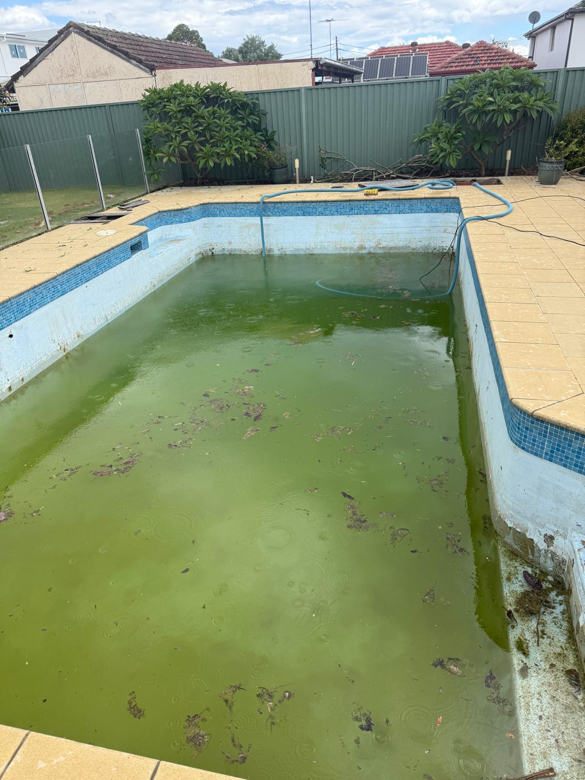
Great job! - Bobby and the team took a swamp and turned it back into a pool - Highly recommended!
Response from the ownerThank you david hope you enjoy your new pool.
DHDavid HarakosGoogle Review
★★★★★
Bobby and Michael were the utmost professionals! On time, great price and most importantly a fantastic job!
Response from the ownerThank you MJ for your beautiful words.
★★★★★
Amazing work Bob is such a lovely man very professional and beautiful work so very happy with the result would recommend Sydney Paintmasters to anyone
Response from the ownerThank you Kathy it's my pleasure hope you enjoy it.
KIKathy IllingworthGoogle Review
★★★★★
I had an exceptional experience with Sydney Paint Masters painting my apartment in Potts Point. The pricing was very competitive and the workmanship was of the highest standard. Bobby, the owner, was hands-on throughout the entire process and his team were professional, helpful, and a pleasure to deal with. They completed the full apartment in a timely manner, always arrived on time, and kept everything clean and tidy each day — which was especially appreciated as I was living in the apartment while the work was being done. I also needed some kitchen alterations around the island bench, and Bobby was more than happy to help. He did an exceptional job and significantly improved the functionality of the space. I wouldn't hesitate to recommend Sydney Paint Masters to anyone looking for quality work and a reliable, professional team.
Response from the ownerAppreciate it Mark your awesome and we really enjoyed working in your place.
MSMark SimpsonGoogle Review
★★★★★
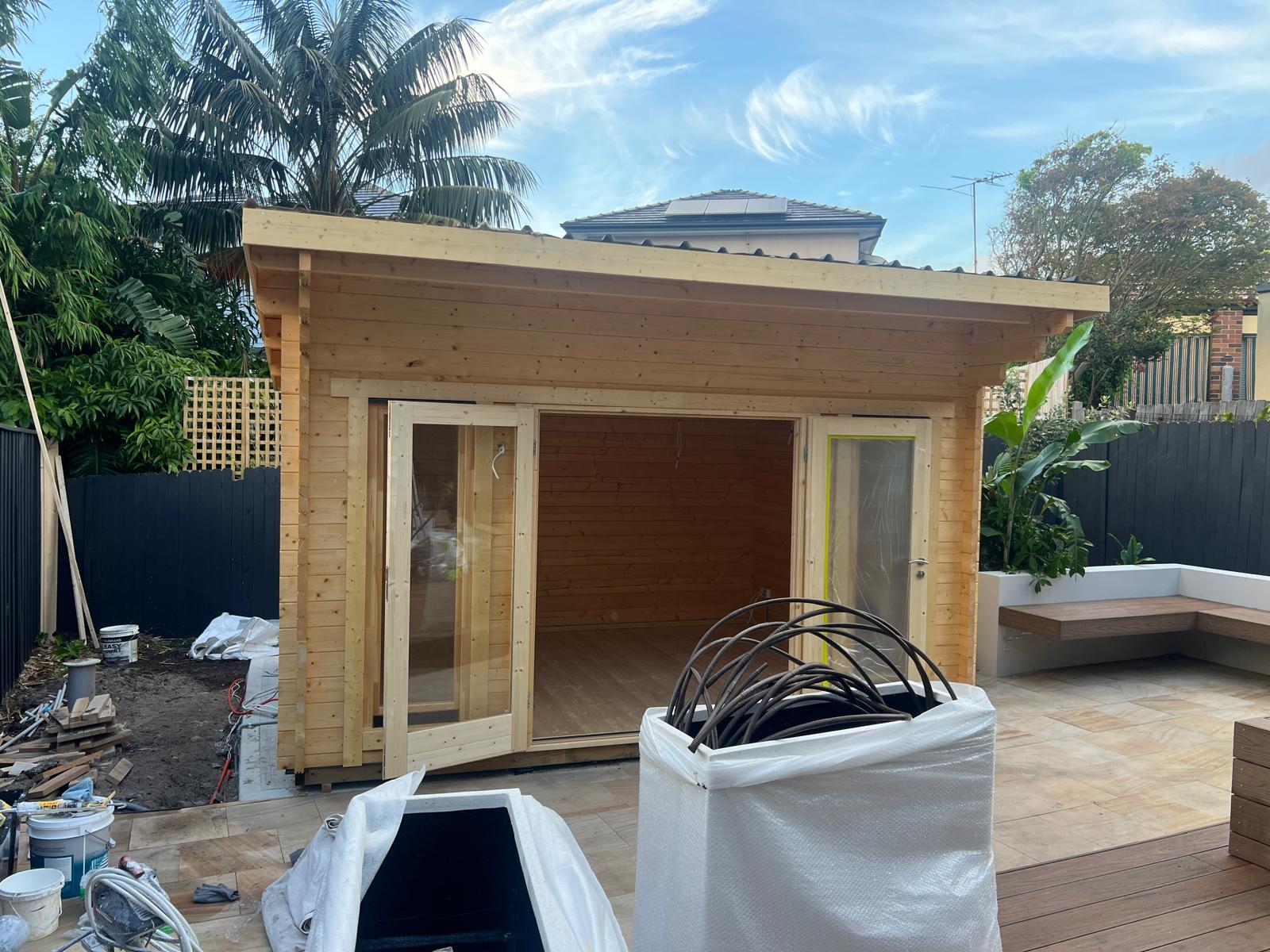
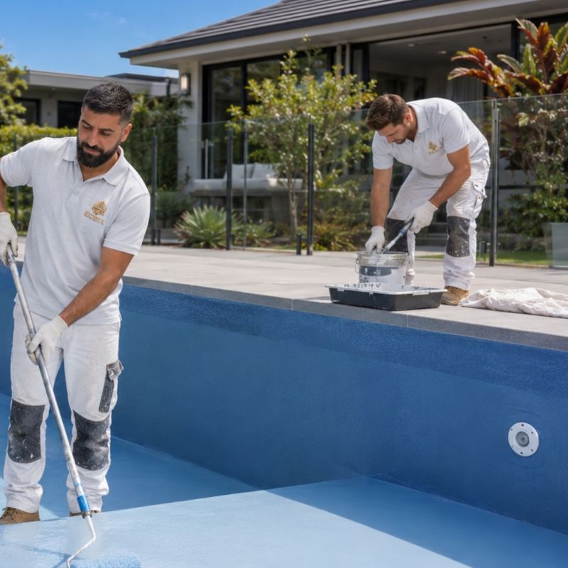
Bobby did a fantastic job on our new Pool deck
Response from the ownerThank you Bob hope you have a lot of fun on your deck.
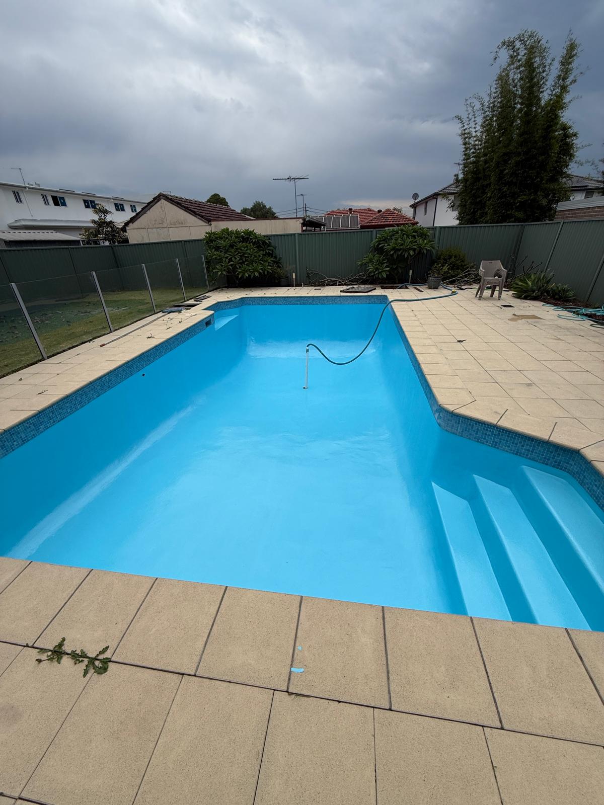
★★★★★
Sydney Paint Masters , carried out Repainting my pool , their preparation and attention to detail , was first class Quality finish, l would recommend them to anyone requiring their services Ed McCarthy retired builder
Response from the ownerThank you ED for your kind words .
EMEdward McCarthyGoogle Review
★★★★★
Quality work and the best Service. Made an appointment and kept it. Highly recommended.
Response from the ownerThank you Lins appreciate it.
LCLins CurtisGoogle Review