
Beyond White: Warm Neutrals Making Sydney Interiors Feel Brighter in 2026
The Quiet Shift Away from Stark White
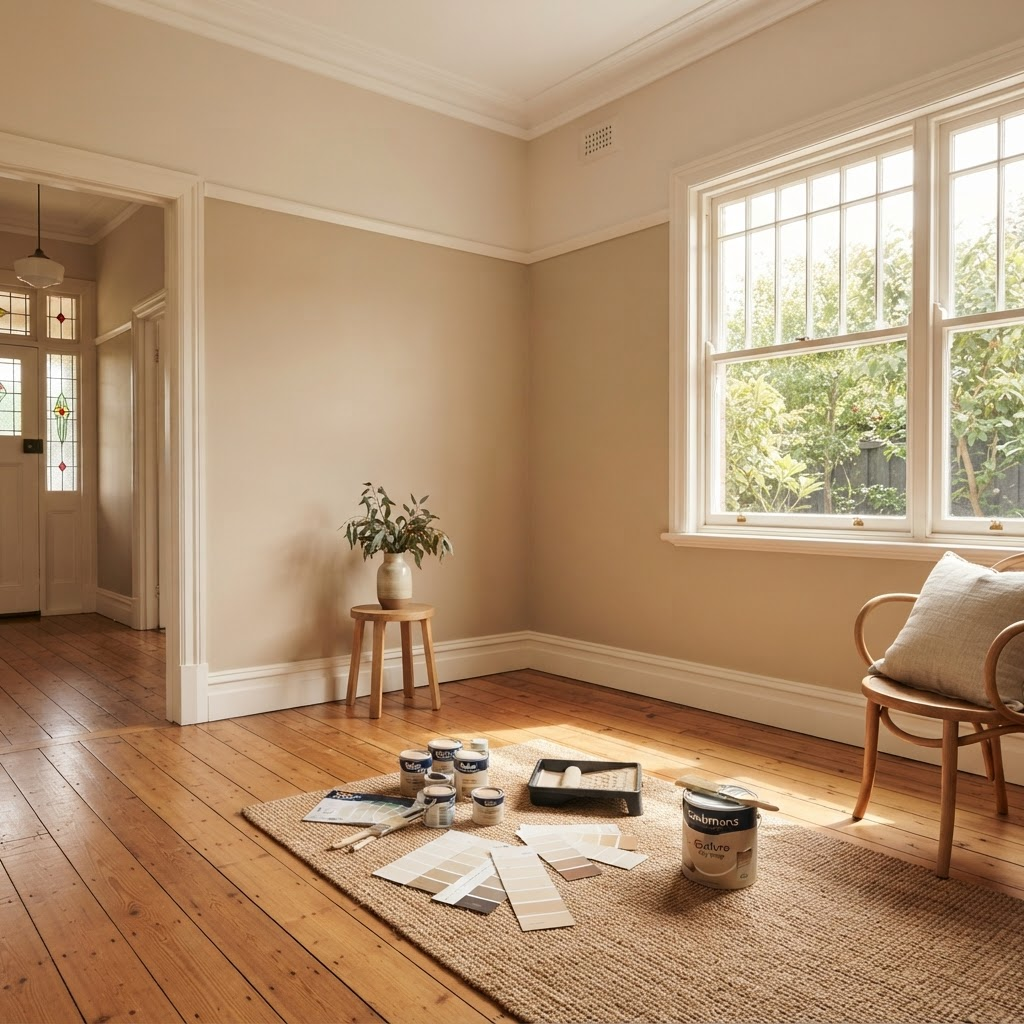
Sydney's love affair with brilliant white walls is easing off. Clients still want rooms that feel open, but they're after softness now, and a bit of personality with it. Enter the warm neutrals. Muted clays, earthy putty, biscuit beige, the faintest suggestion of blush. When the late-afternoon sun comes through, these hues bounce light around the room while taking the hard edge off the glare.
We test colours daily, so we watch them shift from the clear morning sky through to the golden hour. Here's what catches people out: Australian daylight carries a strong blue component, which is why a cool white reads colder on your wall than it did on the swatch. Living rooms end up feeling chillier than anyone intended. Warm neutrals hold their tone against that blue, so the space stays inviting right through to dusk. If an interior refresh is on the cards, house painting experts who understand these subtleties will save you a round of expensive repaints.
Why Warm Neutrals Perform Better in Sydney Light
Sydney gets more than 2,600 hours of sunshine a year. Wonderful, obviously. It also magnifies every undertone you put on a wall. Warm neutrals carry a dollop of yellow, red or brown pigment that counterbalances the blue cast of natural daylight, and the result is a balanced, flattering glow instead of the hospital starkness people complain about the moment a pure white goes up.
Coastal light is its own animal. A room near the water takes in a great deal of reflected blue, off the sky and off the harbour, and that cools every colour in it. This is worth understanding properly, because it gets described badly: the humidity isn't changing your paint's hue. The light is doing that. Humidity affects how the film dries and cures, and in very damp conditions, it can cause surfactant leaching, which shows up as streaking rather than a colour shift. We've tracked how popular colours behave on jobs from Cronulla to Palm Beach, and sandy neutrals are consistently the most stable. They hold up against the cool-tone drift you sometimes get with a taupe.
Testing Colours the Right Way
A5 colour cards help. They're no substitute for a proper trial. Paint a one square metre patch on two walls of the same room, one that catches direct sun and one sitting in shadow, then live with it for a week. You'll pick up the tiny shifts at sunrise, at lunch, at dusk, the ones a paper swatch hides completely. Warm neutrals are subtle by nature, and that slow observation is what stops the nasty surprise once the furniture comes back in.
If you're working over older plaster or a previous deep colour, don't skip the prep. A good primer evens out porosity and stops the old shade from bleeding through. Our piece on using primer before interior painting covers the nuts and bolts.
Finishes That Survive Busy Households
A velvety low-sheen used to mark if you looked at it wrong. The 2026 formulations add ceramic particles, so fingerprints wipe clean without the chalky burnish older paints left behind. For corridors and kids' rooms, we'll usually push a hard-wearing eggshell. Just enough sheen to repel scuffs, low enough reflection to let the warm neutral do its work.
Ceilings deserve a thought too. Pair the wall shade with a ceiling one step lighter on the same swatch card. That small graduation lifts the perceived height of the room and spares you the blinding flash of pure white overhead.
Climate and Timing Still Matter
Sydney's mild winters open an under-the-radar painting window. The humidity eases, which genuinely helps a water-based paint form its film. Be honest about the trade-off, though: cooler days also slow the cure, so give each coat its full recoat time rather than trusting a touch test, because a surface can feel dry long before it has hardened. Daytime temperatures between 15 °C and 25 °C are the sweet spot for avoiding flashing, those uneven patches of sheen. Booking work in May or June can be a good deal smarter than battling the summer rush.
Ventilation still matters. Even low-VOC products give off trace solvents as the film forms, so keep windows open and fans running while you paint and for a decent stretch afterwards. Longer again if anyone in the house has asthma or a chemical sensitivity. NSW Health's Do-it-yourself Safely booklet is the one to bookmark here. It covers the dust and fumes that come off renovation materials, paint included, and it's written for people doing the work themselves rather than for a lab.
Common Mistakes We Still See
- Forgetting the floor. Timber with orange tones will fight a cool-leaning greige every time. Hold the sample pots against the skirting boards before you lock anything in.
- Using the same neutral in every room. Vary the depth a little. A darker hallway reads cosy rather than cave-like, provided you're honest about how much daylight it actually gets.
- Ignoring your light bulbs. Warm LEDs at 2700 K emphasise the beige. Cool LEDs at 4000 K push that same colour toward grey. Pick the bulbs to match the paint, not the other way around.
A Natural Next Step
Warm neutrals aren't just a trend piece for the glossy magazines. They're a practical answer to Sydney's particular light, climate and way of living. Sample thoughtfully, keep an eye on the undertones, and you'll get brightness without the clinical chill of a stark white. If your walls are due for an upgrade, start gathering sample pots now while suppliers have fresh stock, and let the colour sit on the wall for a few days before you commit. A measured approach today saves a weekend of sanding and re-coating later.